Friday, 20 December 2013

Marketing Communications- Digital & Social Media

The objectives of advertising on digital and social media:

  • Sell
  • Serve
  • Speak
  • Save
  • Sizzle
New Diesel campaign has been photographed by Nick Knight all on an iPhone and used the apps 'Glitché' and 'Megaphoto' to edit the photos. It is amazing to see how technology can produce such high quality images now, in the past no one would have thought to use a mobile phone to photograph a fashion shoot. 


Gamification is when brands set up games to play online to advertise their products. 
If one person likes a brand's Facebook page they spend $116 on that brand per year more than someone who has not liked the Facebook page. 

Social Media Campaign: things to think about...
  • Objectives: why are you on it?
  • Research audience 
  • Choose platform; Twitter, Facebook
  • Engage
  • Reporting and measuring
  • How easy the person is to understand- clear message?
  • Confidence in what you are trying to say 


Lecture on Brand identity

I found learning about how a brand identifies itself very interesting. There are several key things which a brand will use to identify itself and make itself known because of that logo, colour or handwriting.

Distilling the brand:

  • Brand extension- creating a new perfume or an underwear range for example. 
  • Brand diffusion- having a collection of products with another brand like H&M for example. This is a sub brand. 
  • Brand collaboration- Working with Coke or Converse to advertise your brand like DVF did with Evian. 
These are the components a brand could use to identify itself:

  • Colour
  • Pattern
  • Motif
  • Logo
  • Crest
  • Device
  • Date
  • Signature
  • Monogram
  • Place
  • Iconic product
In our Photoshop seminar we learnt how to create slides which represent a brand's identity by using just four factors, I used a Logo, handwriting, a motif and three colours. 


DVF

For project two we were asked to select a brand out of five options and research the brand thoroughly by looking at the then, the now and the other. We decided to choose DVF as we knew the brand had a lot of history and we liked the products the brand sold.

We produced a presentation on powerpoint which included information about the history of the brand, the product which the brand is associated with; the wrap dress. We analysed the brand by looking at what colours they use, handwriting and logo. We included these aspects in our presentation so you could instantly tell what brand we were talking about. We also talked about how the brand is advertised on social media and created consumer profiles to see the difference between the old and the young consumer who shop at DVF. We also created a new concept which involved an app where you could create a lip charm of a mould of your own lips and attach it to DVF products.

Our presentation went really well apart from one spelling error on the handout! This has made us more aware to spell check over and over. We got a range of feedback from both the tutors and our peers. We were told that we rushed through the presentation, and we should try to speak slower and more confidently. We were also told that our consumer profiles and the information on social media was especially good. Our peers like the handouts as it interacted the audience and kept them alert to the presentation.


Wednesday, 18 December 2013

London Trip

We went to London to gather research about our chosen brands. My team's was Diane Von Furstenburg and I chose Dries Van Noten. We went to stores such as Harrods and Selfridges to find concessions as well as visiting the DVF store in Mayfair. We managed to collect a lot of information by talking to the head of visual merchandising and by taking photographs of the store.

We also went to the V&A museum to see an exhibition called 'Club to Catwalk' which gave us information about fashion in London in the 1980's. I also managed to find some of Dries Van Noten's work in the museum and managed to take some photos.


Analysing articles

In this seminar we learnt how to analyse an article. The particular article we were given to analyse was called 'Fast Love' from the popular newspaper, The Times. The main point of the article was discussing how many women have very busy lifestyles now, they have important jobs, children, social events and to top that off they are expected to always look their best. This article promotes a new idea to help women always look their best but still give them the time to complete their daily tasks. The idea is to have a beauty salon, where the customer is not paying for the experience, they are paying simply for the service they have asked for. These salons will offer hard working women to have their hair done or makeup, meaning they can look their best all the time in a fast 30 minute service from the salon.

In the seminar we had to read the article carefully and break the writing into sections so we could analyse it critically. We found that in the second paragraph the writer gives other examples which could help women look good all the time, but none as successful as the main proposed idea in the article. We suggested that the tone of voice of the article is quite forceful due to the language used and the writer is trying to relate to the reader. The quotes the writer has used are all quite persuasive which again shows that the tone of voice is quite forceful due to the fact they are trying to get new customers to the salon.

I found this seminar very interesting as I did not take English at A Level, and felt learning how to properly analyse an article very useful to know.


Mulberry Mood Board

Having to produce a mood board for the brand Mulberry meant I had to research the designer brand in a lot of detail. This meant understanding the brand's DNA, what colours they use, images, logo and handwriting... I had to research all of this information so I could produce a mood board which represented Mulberry and described what type of consumer will shop at this brand. After researching Mulberry, I carefully selected 10 images which I thought represented the brand well. I created my mood board in Photoshop and also created a colour palette to suggest the colours which Mulberry are currently using. 

I then had to present my mood board and talk about the brand in detail. I received a great deal of feedback which will help me produce a better mood board for Mulberry.  

  • Use more 'old photos' to represent the past of Mulberry.
  • Have more space on my mood board to make it easy to understand.
  • Made in Chelsea image- Mulberry would not want to be related to the people on that show. Remove image from board. 
  • Main image of Cara in centre of the board is not suited to the colour palette.
  • I could use more PS effects, eg: fade or multiply. 
  • Leaf shapes add depth to the board which creates an interesting effect. 


Sunday, 27 October 2013

Interesting article

I found this article in Vogue which is about the man who designed Mulberry's 'hairy creature' which is now in their latest campaign.


Inspiration

I found this article about Rick Owens Spring 2014 collection, and found the whole concept inspiring. It's such a dramatic way to present a fashion show which will no doubt stay in peoples minds for a long time.

http://www.hintmag.com/post/women-warriors-rick-owens-spring-2014--september-26-2013-2145


Mulberry timeline

http://www.vogue.com/voguepedia/Mulberry

Researching Mulberry for my mood board


http://www.mulberry.com/explore/about-us

http://www.style.com/fashionshows/review/S2014RTW-MULBERRY/

http://www.mulberry.com/collections/AW13

https://www.youtube.com/watch?v=BlrZHBnLLTg

http://www.mulberry.com/journal/a-film-by-norman-wong/

http://www.mulberry.com/journal/mulberry-wedgwood/

http://www.mulberry.com/journal/in-conversation-with-tim-walker/

"Spring Summer 2014 revisits the Mulberry defining attitude 'Le Style Anglais' with its laid-back interpretation of heritage luxury. For the new season Mulberry is both town and country; influenced by modernist overtones from Sixties London juxtaposed with the opulence of the quintessential English country house and gardens."
"In its style and attitude the collection embraces both familiarity and modernity, working with classic prints and textures reinterpreted to create new season signatures imbued with Mulberry's inherent British wit. A palette of serene neutrals and pastels include Cream, Ballet Pink and Summer Blue, highlighted with the new 'Fab Floral' print in Fiery Red."


Saturday, 26 October 2013

Segmentation, Targeting and Positioning

In this lecture we learnt all about how brands position themselves and how we, as consumers are targeted by those brands. Here are the definitions I wrote down in the lecture;

  • Positioning is a process and a strategy that may or may not succeed 
  • Position is the actual metal slot where the consumer places the brand relevant to others
  • Positioning strategy is the choice of target segments
  • Rebranding is doing the same thing but change the logo, or colour palette for example
  • Market segmentation is breaking up the market into segments then working out how to cater for that segment
  • Masstige is a designer collaboration with a brand to make high end affordable 
  • Consumer segmentation is grouping customers to target by looking for similarities
In the seminar following this lecture we talked about the different fashion tribes and how brands target different tribes. We thought of tribes such as;
  • Hipster
  • Bohemian
  • Granny chic
  • Vintage
  • Indie
  • Scene kid
  • Mod/Rockers
  • Hippy
  • Preppy
We then discussed about whether we believe that we are targeted as part of a tribe or whether we consider ourselves to be completely individual. I believe that everyone belongs to some sort of tribe, whether they like it or not and they may not believe that they are being targeted by these brands but they are. 

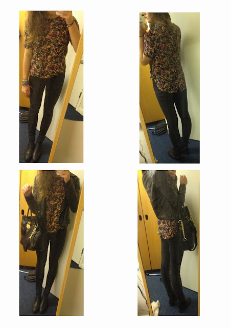
We were asked to bring a picture of ourselves in our favourite outfit to this seminar. We had to describe what type of consumer we believed we are and what tribe we fit into. I said that I am quite a high street consumer, I mainly shop in Zara and Topshop but I do have the odd designer accessory/ piece of clothing. I believe that I am quite a rocker, I cant go anywhere without my leather jacket and I always wear a lot of black. My favourite shoes are my Chelsea boots and I try to add a splash of colour to my outfit with a bright top or necklace, this is why I think I am in the 'rocker' tribe.
 

Photoshop

I learnt about Photoshop at school but having seminars about it has been interesting as I have learnt new ways to do things and refreshed my memory on certain methods!

In our first Photoshop seminar we learnt how to create blocks of colour, select and copy parts of an image, and how to duplicate an image. I created a page called 'Ornate' by using these methods.
 
In our next Photoshop seminar we learnt about colour palette. This followed on from the lecture we had about colour theory. We were asked to produce a colour palette from an image relating to our brand, my brand is Mulberry. I created three different colour palettes to compliment this image. I did this by selecting different colours from the actual image and using them to create different coloured blocks. For my second colour palette I thought about the proportion of different colours to see what effect this had on the viewer's eyes. I wanted the dark brown to be the strongest colour in this colour palette and I found by having just small blocks of the brown against bigger blocks of colour it stood out the most. 

In our colour theory lecture we also learnt about; hue, value and chroma. In our photoshop seminar we learnt how to change the hue and saturation of an image. Meaning I created a page incorporating images from my brand (Mulberry) in different saturations with different hues, which I think has created an interesting effect. I also used the other methods I learnt in previous Photoshop seminars, such as creating colour blocks and copying part of an image. 

Street style brief

We were split into new teams for this brief and the aim was to capture images of individuals who represent the individual fashion in Nottingham. Another aim was also to determine what fashion tribes can be found in Nottingham.

When walking around Nottingham, we noticed there were many different fashion tribes, and everyone seems to have their own individual style. My group photographed a lot of different people, who didn't necessarily fit into a certain tribe but they had a quirky look which made them stand out from the crowd. We also focused a lot on footwear and took several shots of different accessories as well.

This brief was very beneficial to me as it made me more confident as I had to go up to complete strangers and ask if we could take their photo. It has also made me more aware about street style when I am walking around the city.


Mood board activity- My favourite fashion brand/designer

For this activity I selected my favourite fashion brand as Zara. I love shopping in Zara as the clothes they sell all have the expensive look but are not that expensive at all. I decided to focus my mood board on the popular fashion trend- the 'tailored look'. I looked through magazines such as Elle, Vogue, Now and Grazia to find relevant images which represent the tailored look which I think could be found in Zara stores. I then decided I was going to create two mood boards. One which would show 'the classic tailored look' and the other a more 'quirky' version. The 'classic' mood board consisted of very plain colours, mainly black, navy and white. The 'quirky' version has a variety of different patterned suits with many different textures.

When producing the mood boards I thought a lot about white space, and how I can draw the viewer's eyes to look at every image in detail, or at least study what I think are the most important images. I did this by layering some of the images, and the images I wanted to stand out I have left white space around them so the viewer's eyes are attracted there.

My first post and the 'Pre arrival task'

I am studying Fashion Communication at Nottingham Trent University. This blog is going to express my thoughts and feelings on fashion and the many different things I will be learning on my course.

Before I came to Nottingham Trent University we were set a 'pre arrival task'. I had to bring three digital, retail and printed examples of things I thought communicated fashion in an interesting and modern way. I chose Tim Walker's website, lostateminor.com, and art2day.com as my three digital examples. I felt these websites represented modern fashion in an informative way. 

For my retail examples, I took a photo of the visual merchandising in Urban Outfitters as they had a small collection of women's products on display in the men's section which I thought was a good idea so passers by could see that they also have a women's  collection. I also photographed Laura Ashley's window as they had an interesting pattern on the window drawing the consumers eyes to the products which were on display. I photographed a window display from a sports shop, they had trainers hanging from the window which I thought was a quirky and modern way to display products. 

For my printed examples I selected an article which I found in an old Vogue magazine which was called 'Make do and Mend'. This focused on using recyclable materials to make outstanding clothes. I also chose the magazine, 'i-D' as it is a popular fashion magazine with great photography. My final printed example was an article I actually found on Bazaar's website showing Mary Katrantzou's fashion show at London Fashion Week. It showed how she has created a whole dress collection inspired my shoes. I thought this collection represented modern fashion and how designers can be inspired by such simple things.  

When we had our seminar discussing our pre arrival task, we were split into small groups and were able to see each others take on the task. We then had to select the best examples out of our group's selection, and present them to the whole seminar group. This was an interesting discussion as we got to see many different examples of how fashion is communicated.